problem
Most booking apps allow the user to sort through many flight options available, with price being the primary factor. However, the process is often lengthy and overwhelming. As a result, travel bookers may struggle to choose a flight that matches their unique preferences or even determine if the flight they have booked meets their expectations. While price is undoubtedly crucial, users should also be able to sort flights based on their specific preferences and expectations more efficiently.
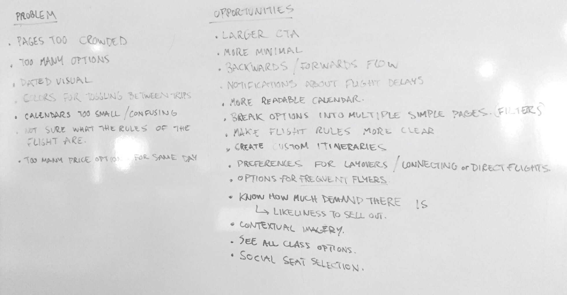
- ●Pages are too crowded and overloaded with information.
- ●There are too many options, making it difficult to make a decision.
- ●Special perks are challenging to find.
- ●The price option can be confusing.
research
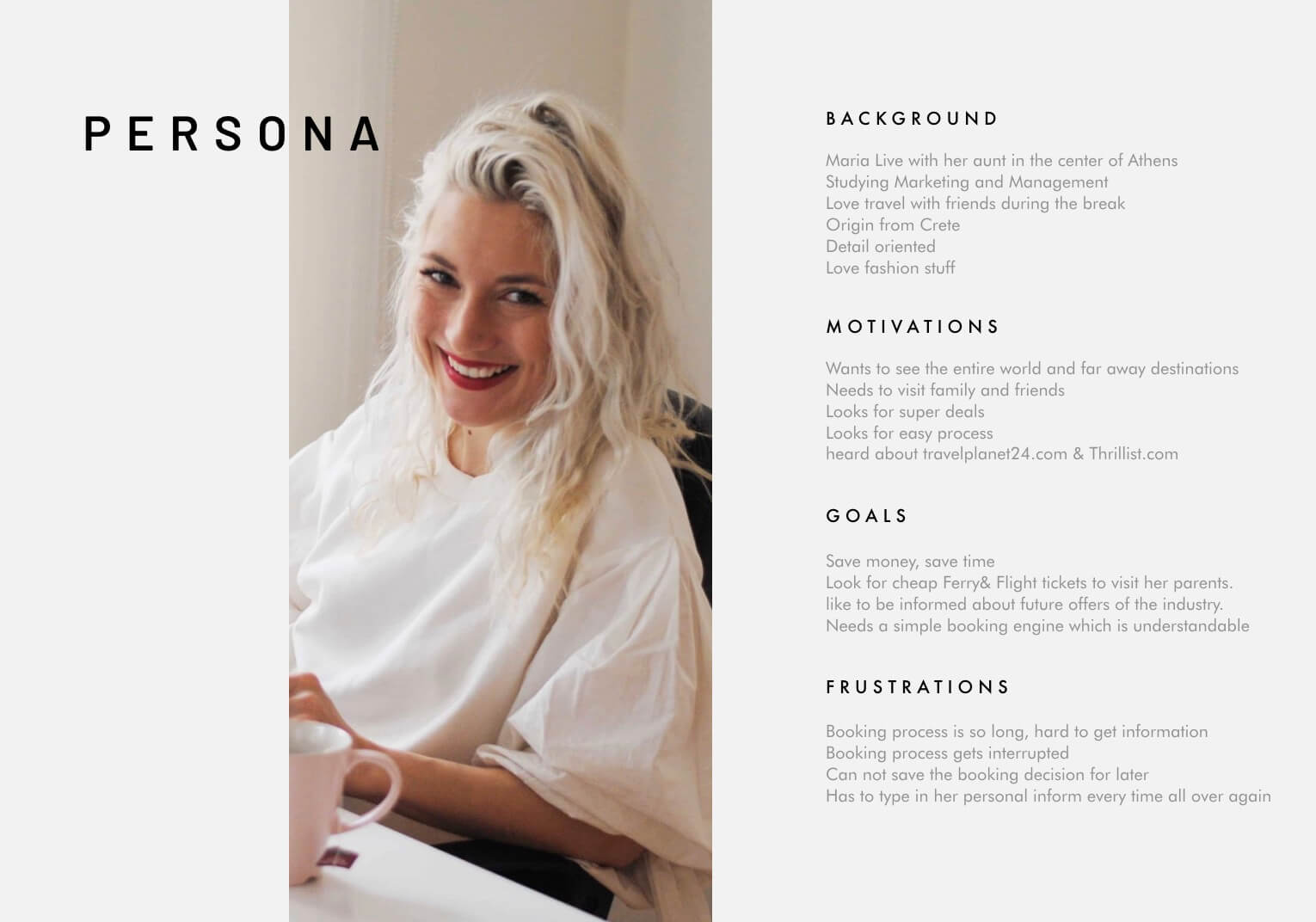
In addition to gathering competitor research, I conducted five interviews with people using their favorite flight booking tool. Overall, I conducted twelve semi-structured interviews and observations, and used the information gathered about their habits and preferences to graph the relationships between this data. From this data, I distilled the information into a persona based on one of my interviewees, Maria, because she represented a subset of short-distance travelers who focus on vacation travel and domestic flights.
"Why is the flight booking process so long and overloaded with information? There are tons of choices I need to make. Booking flight tickets should not be that difficult."
wireframe and iteration
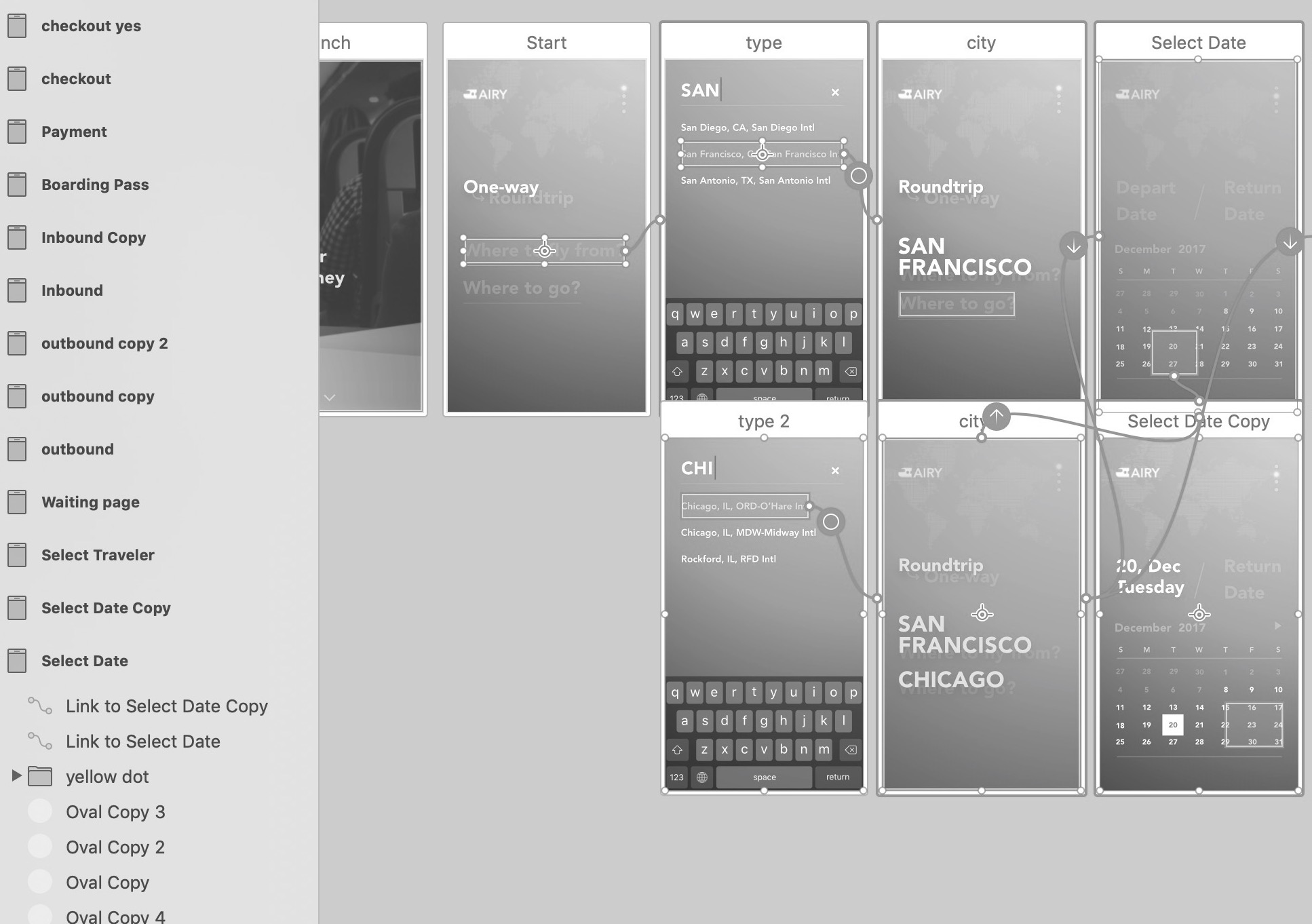
I contributed a bunch of sketches to my peers' review, which ideated over things like filtering choices, user flows, and scenarios. I ultimately chose one of my sketches to move forward as the basis of my design. Then, I started designing the interface in Sketch because I wanted to use Adobe XD to tie screens together for this project, which gave me an opportunity to explore both tools.
After experiencing an issue with Adobe XD, which did not allow users to select any combination of perks at once and have those screen partials display simultaneously, I switched to Flinto to complete the whole flow with meaningful micro-interactions. Ultimately, this allowed me to test with more accuracy which flight options and task flows were more important to users.
design insights
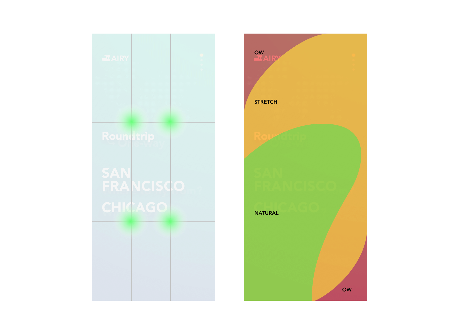
Visually, I used the Rule of Thirds, which is a basic graphic theory. We could imagine dividing the screen horizontally into three equal sections and putting the main information and interactive elements into the grid. This followed the capital F visual flow, where the eye naturally starts at the top left, moves to the top right, and then back to the bottom left and right. This approach provides greater stability and balance while also creating a good informational hierarchy.
Interactively, the layout followed the direction called the Thumb Zone, which is a heat map of phone devices. It shows how easy it is for our thumbs to tap areas on a phone's screen. Compared to a normal booking app, it was easier to control. I avoided situations where buttons were placed at the top of the screen and were hard to reach, especially on larger screen mobile phones. This improved the reachability and solved that problem.
Combined, the new booking flow makes it much faster and easier to book a flight ticket than before, reducing the number of steps from 10 to just 5. This is possible due to an emphasis on the key information required for the primary user flow and de-emphasizing the rest. It's all about establishing a clear hierarchy: to guide users to their desired actions, we must minimize unnecessary details and highlight the key pieces.
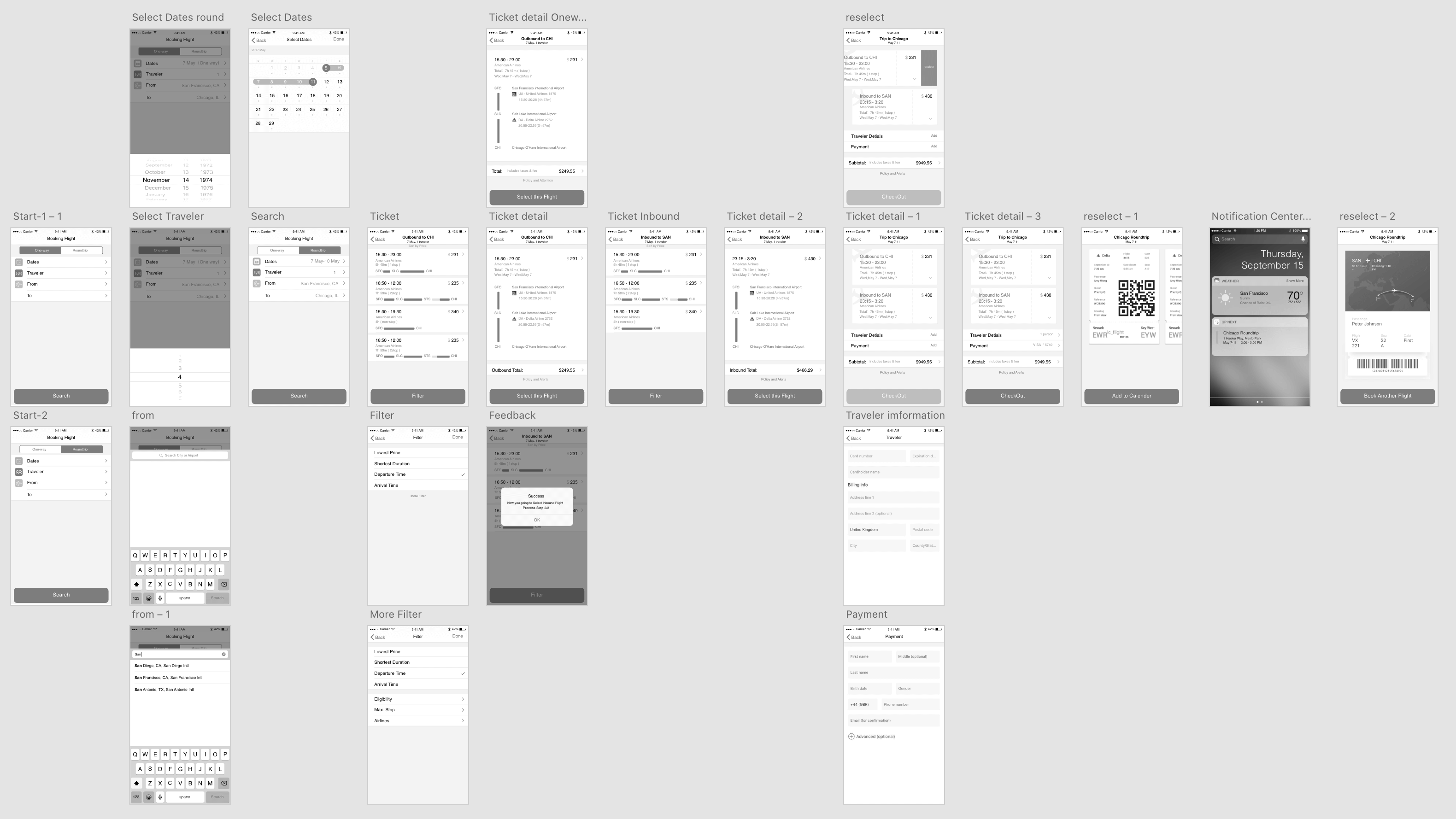
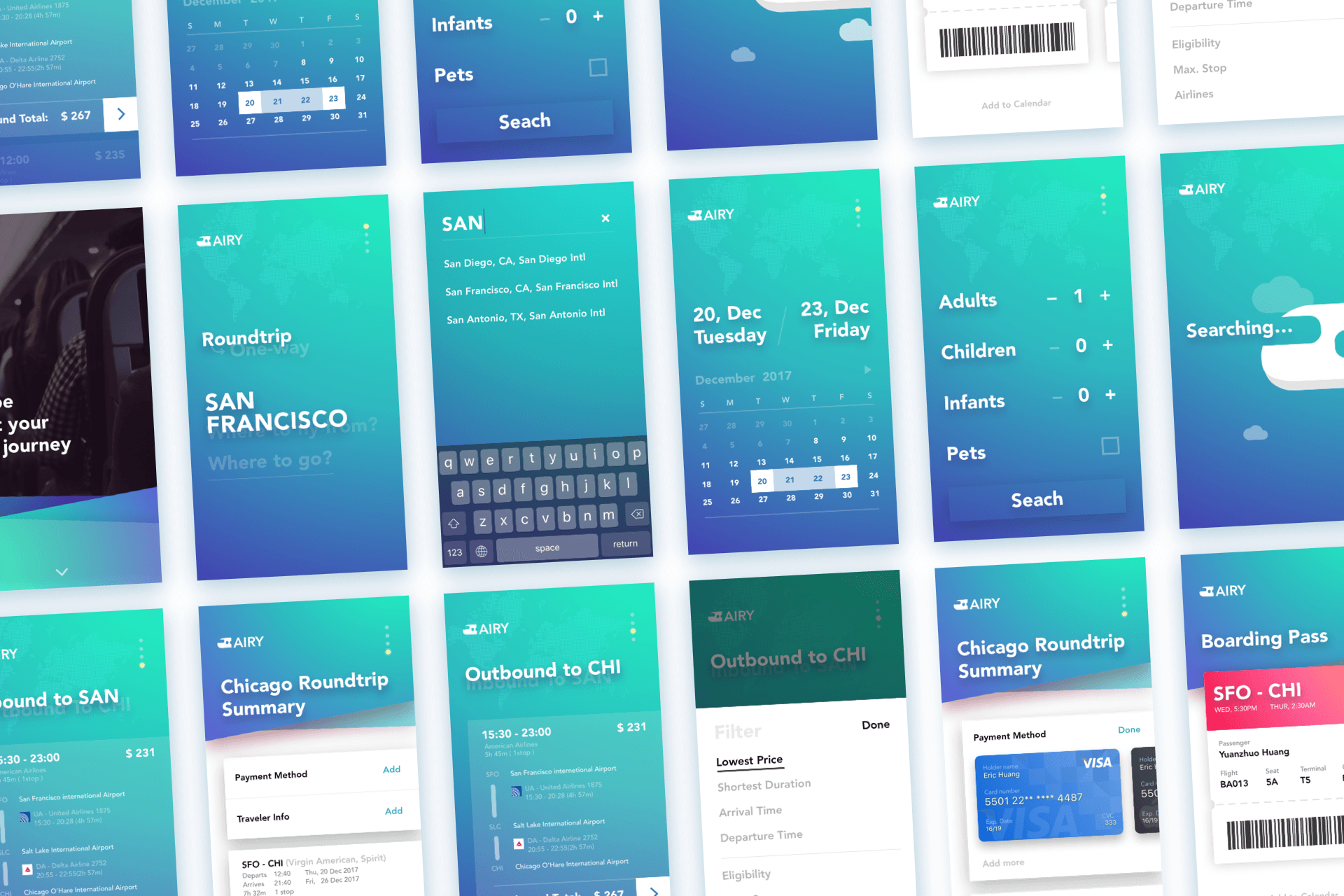
interface design
user testing
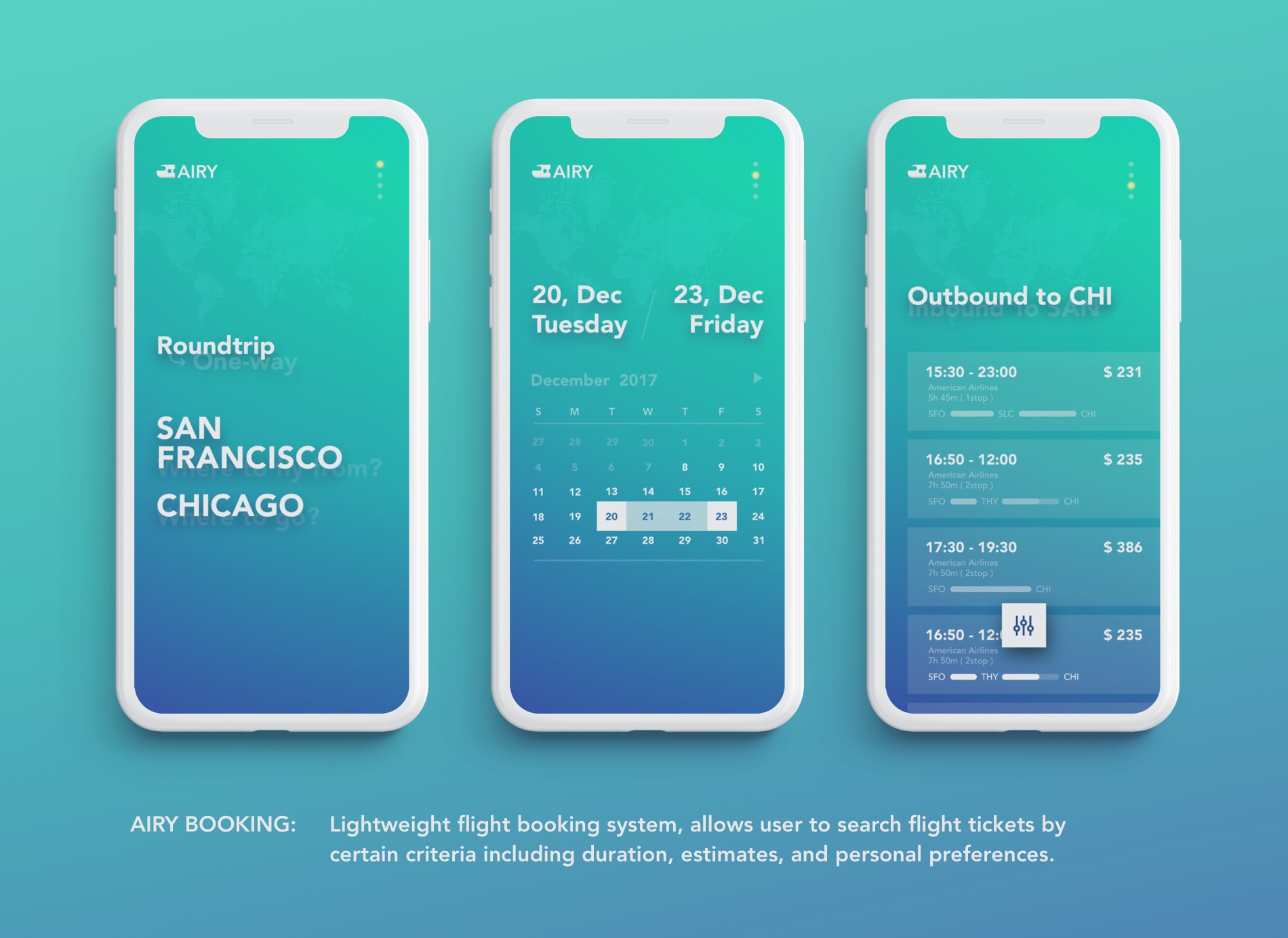
After completing my Flinto prototype, I tested it with several participants using the same prompts. These prompts included: "Imagine you'd like to book a flight from San Francisco to Chicago from Dec 20th to Dec 23rd, show me how you would do that" and "Imagine you are booking a flight from SFO to CHI with a friend and your dog, show me how you would do that".
After receiving feedback from eight people who tested the prototype in different environments, I found several problems with it. The schedule interface was confusing for users and led them to click the wrong button. The close icon was also confusing, and the information hierarchy on the check-out step was not clear.
To address these issues, I made a quick iteration of the prototype with plans to retest. I changed the 'X' icon to 'Done', added a schedule animation indicator, and simplified the overall flow. The final prototype looks like the one below.
final prototype
what i learned
What makes Airy Booking unique is the deconstruction of the entire task flow and prioritization of the primary user flow while applying universal product design philosophies such as establishing a clear information hierarchy and minimizing every step. Through this project, I learned the importance of deconstructivism and prioritization in mobile application design. Special thanks to Jerome Tave's guidence, and all folks' feedback.